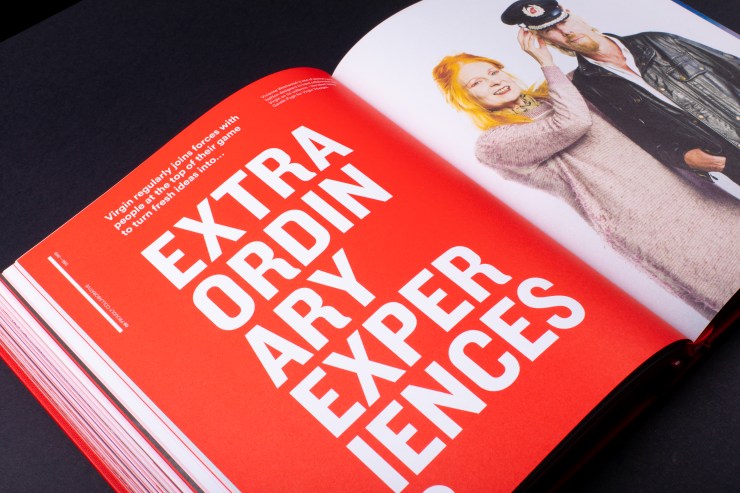
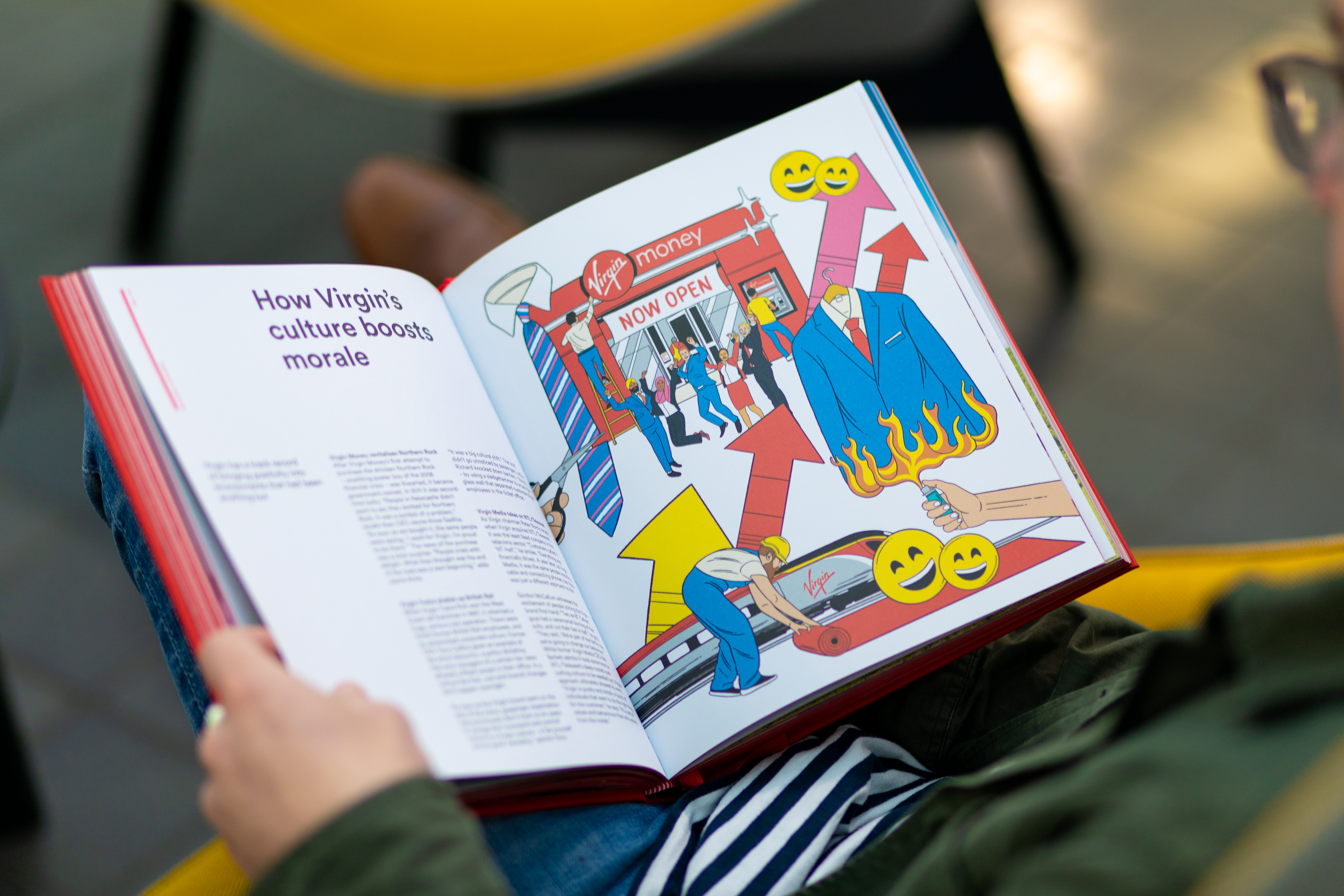
As a contributing editor for Creative Review, I’ve created content strategies for global brands including Frontify, Figma, Meta and TikTok.
Together, we transformed CR’s approach to branded editorial, developing multi-part series that engage an audience of senior design professionals while achieving each partner brand’s strategic objectives.
The work balances three objectives: maintaining CR’s high editorial standards, engaging the design community with compelling and relevant insights, and achieving measurable results for brand partners.
By treating sponsored content as seriously as editorial features – with rigorous research, compelling angles, and authentic perspectives – the content earns reader attention rather than interrupting it.
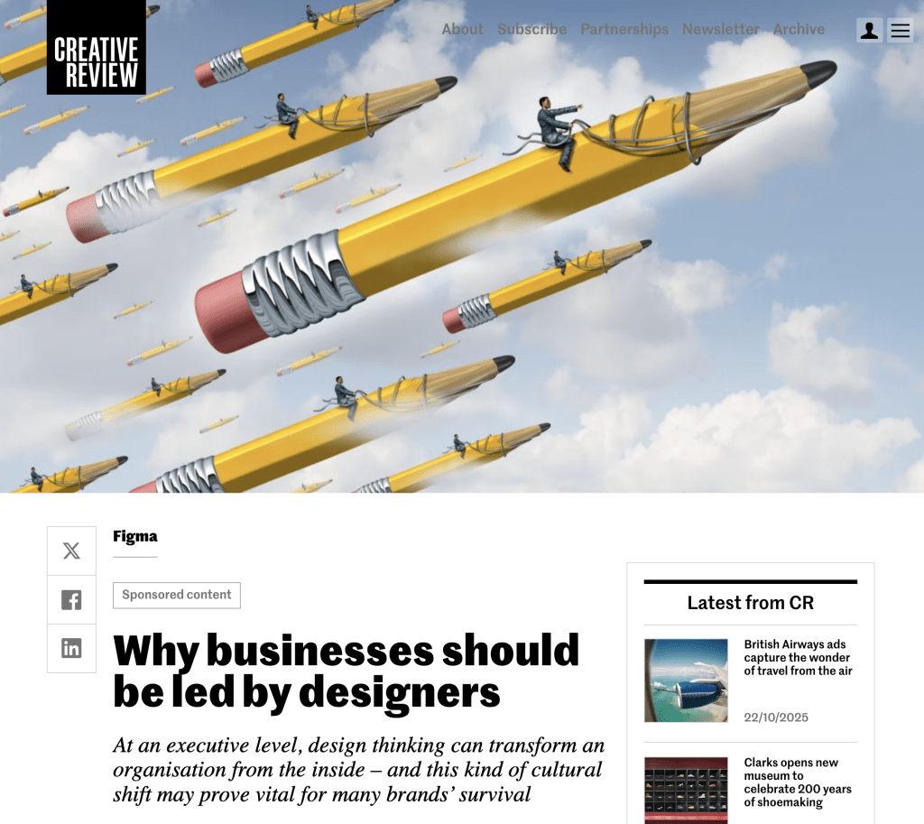
Figma
Why businesses should be led by designers
At an executive level, design thinking can transform an organisation from the inside – and this kind of cultural shift may prove vital for many brands’ survival
Why non-designers must understand design better
Appreciation of the design process should permeate an entire organisation, not just its in-house creative team
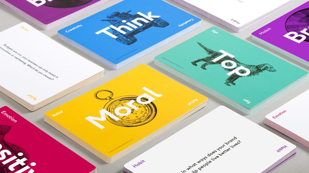
Frontify
The trick to pushing creative limits without losing control
How to balance rule-breaking creativity with the need for measurable performance and brand governance
Why a brand-building platform helps creativity thrive
Some extra groundwork to create a ‘single source of truth’ when building a brand empowers everyone down the line
Team ITG
How virtual production is changing the way ads are made
Virtual production unlocks limitless creative possibilities, while making the process more efficient and sustainable
Pushing the limits of creativity with virtual production
VP’s rapid evolution helps brands break new ground without breaking the budget
TikTok
How brands can be authentic on TikTok
Insider advice from Burberry, Rimmel and Duolingo to thrive in TikTok’s world of democratised creativity
Why brands should be part of the community on TikTok
Move aside, always-on marketing: brands need to be ‘always in’ to win the trust and attention of TikTok’s diverse communities
Meta
How the metaverse could transform brand engagement
Early adopters in fashion and entertainment are blazing a trail, but how could brands in other sectors embrace the potential of the metaverse?
Unlock more immersive brand experiences in the metaverse
Brands must dream big to push experience design limits in the metaverse
“Nick has all the attributes of a great content strategist – a strong sense of editorial values, audience interests and commercial awareness. He has become integral to our team.”
Michael Barnett – Commercial content editor, Creative Review and Marketing Week