Championing a cleaning brand’s sustainable vision

I helped Superunion tell the brand story of eco-friendly cleaning company Delphis Eco.

Following a joint briefing with the creative team and the client, I conducted an in-depth interview with Delphis Eco’s passionate, self-confessedly belligerent founder Mark Jankovich.

The first section, below, captures the story’s unlikely origins in the world of cut-throat finance – where Jankovich had the epiphany that drove him to drop everything and radically change his career direction.

“I woke up one day and thought, ‘Enough’s enough.'” – Mark Jankovich

Mark’s story

It was 2007, the year before the finance sector went into meltdown.

Mark had been working on a more joined-up approach to RBS Group’s corporate social responsibility. He argued that the banking giant needed to consider its impact on the world.

But profit was king, and Mark’s holistic plan was laughed out of the room. He quit the next day, with a burning desire to make a meaningful difference in whatever way he could. His goal was simple: build a business, any business, that could have a net-positive impact. After scouring the globe for candidates, he discovered a Liverpool-based chemist making professional-standard cleaning products from eco-friendly natural ingredients.

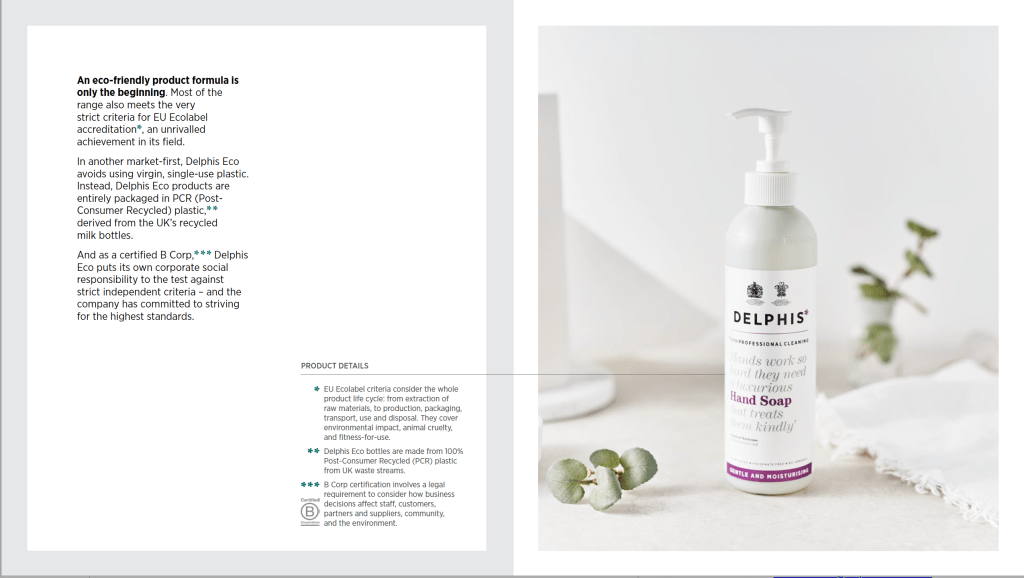
Delphis Eco leads by example when it comes to sustainability

The business had been struggling, and had racked up significant debts. But despite having no experience in the sector, Mark saw huge potential for social and environmental impact.

Shortly after the birth of his second child, and with no salary as a safety net, he threw everything he had into the venture, adopting a one-star roadside hotel as a rudimentary base near the warehouse in Bootle while he worked to turn the business around.

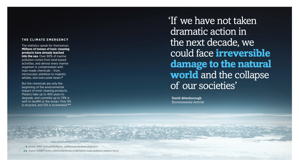
The brand story is set firmly in the context of the global climate emergency

Mark was prepared to roll up his sleeves and get his hands dirty. To win one of Delphis Eco’s first major contracts, he spent seven months getting up at 4am to scrub Iceland stores, demonstrating to the supermarket why it should switch.

He also knew he had to get the products into the right hands, so cut out the middleman. Knowing the Prince of Wales to be an ardent eco-campaigner, he cold-called Clarence House and challenged the Prince’s staff to test the products. The risk paid off, ultimately leading to Delphis Eco receiving two Royal Warrants.

At the heart of Delphis Eco’s success story is Mark’s refusal to accept something is impossible, and the passion, belligerence and drive to prove it can be done.

Mark has lobbied the UK government to promote sector-wide change

The story goes on to explore how Delphis Eco has responded to the bigger-picture context of the climate emergency, and reveals the brand’s many sector-leading green innovations and related campaigns – including lobbying for meaningful change at the highest level.
Celebrating 50 years of the Virgin brand

I am the author of Virgin By Design, a premium ‘coffee-table’ book celebrating 50 years of the Virgin brand.

Collaborating closely with the Virgin Group brand team and the book’s publisher Thames & Hudson, I helped develop a content strategy to appeal to brand designers, creative marketeers and ambitious entrepreneurs.
Rather than a chronological retrospective, we agreed it would be more compelling to tell the story thematically, exploring the unique characteristics that make the Virgin brand special.

Buy a copy of Virgin By Design on Amazon

The process involved over 120 interviews with CEOs, CMOs and other influential individuals responsible for shaping the past, present and future of the Virgin brand – from the early days of Virgin Records and Virgin Atlantic in the ’70s and ’80s, through to present-day innovations from the likes of Virgin Galactic and Virgin Voyages.

Drawing on hundreds of thousands of words of transcript, I crafted the many diverse stories into 10 distinct chapters. These explored areas such as Virgin’s ‘cheeky start-up’ mentality, the importance of taking risks and innovating, the ‘feel-good experiences’ and ‘magic moments’ at the heart of the brand, and how Virgin can stay relevant for the next 50 years.

With multiple senior stakeholders involved – including Virgin Group’s chief brand officer and global CEO, as well as Richard Branson himself – my copywriting brief was to capture Virgin’s brand values, while remaining engaging and entertaining for an external audience.

Nick helped us shape a cohesive narrative from multiple voices. He was quick to understand Virgin’s brand principles and history, and convey it seamlessly throughout the book. Nick’s skill in finding compelling stories translates to a joyful yet comprehensive read. He was a joy to work with.

Charlotte Bufton – brand manager and project lead, Virgin
Virgin By Design’s 10 thematic chapters. Image credit: Virgin

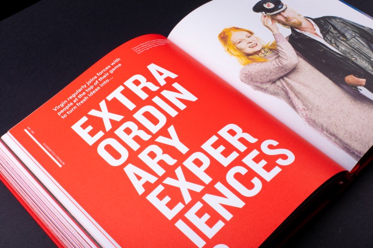
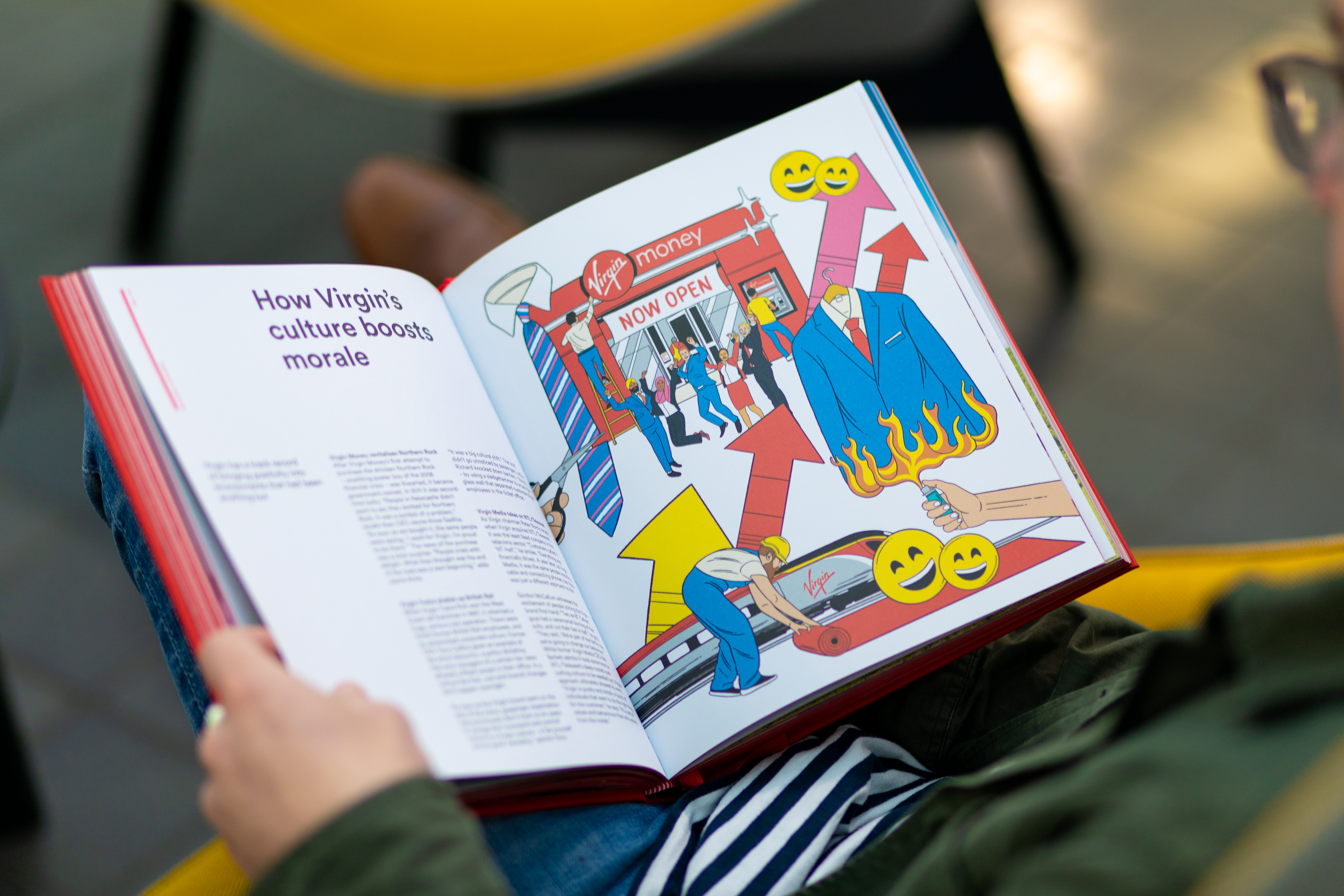
Fascinating archive photography, striking campaign visuals and playful commissioned illustration bring the featured stories to life.

The design, by Pete Rossi at RM&CO, encourages different levels of engagement. Readers can flick through for visual inspiration, or deep-dive into each chapter’s theme.

Content formats vary from bite-size captions to long thematic reads, bound-in as inserts amongst full-bleed images to maximise visual impact. Gatefolds expand the canvas at key points to do milestone campaigns justice.

“Nick’s deep understanding of how branding and design work within a business, and his industry knowledge and contacts, make him an invaluable member of a creative team.”

Andrew Sanigar – commissioning editor, Thames & Hudson

Virgin By Design was published by Thames & Hudson in March 2020.

Awards for Virgin By Design
Silver Award – Graphis Design Annual 2021
Highly Commended – Drum Design Awards 2020
People’s Choice – Creativepool Annual 2020

Rolling out tone of voice for a European bank

HROD logo showing four quadrants. Image credit: 31% Wool
  • Client: 31% Wool / EBRD
  • Disciplines: Copywriting, tone of voice
  • Duration: 9 days

I helped 31% Wool make EBRD’s HR department more engaging and approachable.

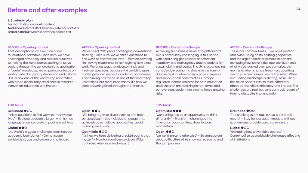
31% Wool’s verbal narrative for the European Bank of Reconstruction and Development’s newly formed ‘HR and Organisational Department’ (HROD) is based on four ‘quadrants’ that play on banking terminology.

All communications are framed in terms of assets, liabilities, risks and returns. HROD might describe people as its “greatest asset”, for instance, or discuss “unlocking returns” for its staff.

My brief was to translate this conceptual approach across a range of materials – from landing pages to onboarding packs – while balancing the need to be punchy and direct, but also warm and welcoming.

Read more on 31% Wool’s website…

Landing pages from HROD website. Image credit: 31% Wool

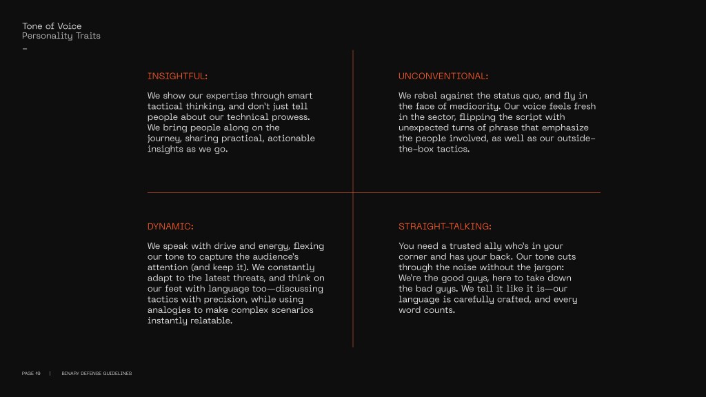
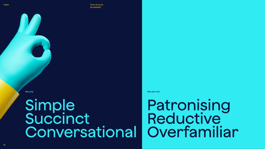
I also wrote guidelines to help HROD staff maintain this tone of voice across other day-to-day applications.

Tone of voice booklet for HROD. Image credit: 31% Wool

“Nick quickly grasped the intricacies and breadth of the client’s verbal comms, and brought to life some previously quite generic pieces with our new verbal language and a consistent tone of voice. He was happy to turn around some tight client deadlines, and I hope we’ll be working on more projects together in the future.”

Julia Woollams, creative director, 31% Wool

Telling the story of Carlsberg’s global rebrand

Carlsberg’s re-crafted logo. Image credit: Taxi Studio

I helped Taxi Studio develop a content strategy for its award-winning Carlsberg rebrand.

The strategy focused on three core areas – the re-crafting of the mark and other brand assets; the holistic design and packaging system; and Carlsberg’s wider sustainability story, in which the rebrand plays a central role.

Working closely with Taxi’s in-house marketing and creative teams, I conducted piece-to-camera interviews in both Taxi’s Bristol studio and Carlsberg’s Copenhagen HQ, then scripted and edit-produced videos that have since formed part of many successful awards submissions.

The videos were accompanied by ghostwritten articles to tell the story in more detail. These became core case studies on the Taxi website, as well as attracting the attention of specialist publications such as The Dieline.

Part one: Crafted to Last

How the rebrand translates across packaging and POS. Image credit: Taxi Studio

We’ve collaborated with Carlsberg on a major global rebrand, unifying its diverse markets with a simple yet versatile identity system that champions the principles of great Danish design.

Following extensive research into the brand’s 171-year heritage, Carlsberg’s famous brand elements have been carefully re-crafted for the first time in several years, striking the perfect balance between form and function...

Read more and watch video on Taxi’s website…

Part two: Danish by Design

Different variants in the holistic packaging system. Image credit: Taxi Studio

At the heart of our global Carlsberg rebrand is a simple phrase: “In constant pursuit of better.” Drawn from the ‘Golden Words’ penned by Carlsberg founder JC Jacobsen, this pledge drives everything from the quality of the brew, to the company’s sustainability credentials, to how its brand is presented to the world.

With no holistic look and feel to tie the regional variants together, or clear set of rules to govern how different assets were used, the Carlsberg brand was presented inconsistently from market to market. Another challenge was to unify all expressions of it as part of a coherent, master brand-led system...

Read more and watch video on Taxi’s website…

Nick is an excellent writer with a particular set of skills, skills he has acquired over a very long career, skills that make him a dream for people like you. Try him once and you’ll be taken. Just like I was when we worked together on the Carlsberg brand – he’s a trusted ‘go to’ for us.

Spencer Buck – creative partner, Taxi Studio

Arguing a strong case for ‘brand euthanasia’

Image credit: City AM
  • Client: Red Setter / B&B Studio
  • Disciplines: Thought leadership, ghostwriting
  • Duration: 1 day

I collaborated with Red Setter and their client B&B Studio on a provocative thought-leadership article about ‘brand euthanasia’. In the firing line: lazy, slow-moving brands that have lost their relevance, but are kept on life-support by empty ‘brand refreshes’ and nostalgia.

The article argued that old-fashioned brands that no longer cater to a real need or desire should make room for the next generation of challengers – and moreover, that no one will miss them when they’re gone.

Alongside high-street failures Woolworths and Blockbuster – too sluggish to adapt in the age of Amazon and Netflix – this included the counter-example of a heritage brand that has managed to stay relevant: Marmite.

Fuelled by expert insights and contentious opinions from B&B’s senior team – including bylined strategy director Lisa Desforges – the ghostwritten article was placed by Red Setter in the City AM opinion section.

Read the story on City AM

Clarifying an agency’s new strategic positioning

Image credit: Studio Output

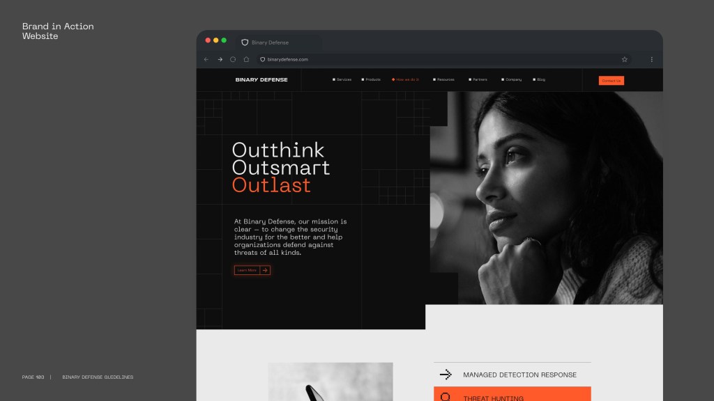
I helped Studio Output articulate how it helps brands to “adapt and thrive in a connected world”.

Following an in-depth briefing session with the senior team, I worked closely with executive creative director Rob Coke to translate the agency’s new strategic positioning into a thought leadership article.

Read full article on Output’s website

Here’s an excerpt:

Why your brand must adapt to thrive

The connected world has shifted behaviours and transformed expectations. As consumers, we’re faced with more choice, more powerful technology and more immersive experiences than ever before. In this world, the experience of your digital products is what defines your brand.

Switched-on brands – those that understand the importance of embracing a digital mindset to succeed in today’s world – are disrupting their sectors and dancing to the rhythm of fast-changing demands. They’re not just responding to the future, they’re creating it – by continually pushing boundaries and challenging themselves to adapt to the unknown ahead of their competitors.

Airbnb put the idea of ‘belonging’ at the heart of every touchpoint. Netflix’s design and motion language showcases the content you love. Uber’s recent rebrand unifies its services with a modern, relevant visual system. And trillion-dollar giant Amazon completely re-framed expectations of service and delivery.

To disrupt their respective sectors, these four all understood one thing: the power of experience as a differentiator. They take people on a journey that conveys their brand values and personality at every touchpoint... [more]

Nick has a knack of capturing the magic of an interview and distilling it into attention-grabbing copy.
He makes the process enjoyable, and meets his deadlines. What more can you ask?

Rob Coke – executive creative director, Studio Output

Capturing the magic of BBC 2’s award-winning rebrand

20 different ‘mood’ based animations for BBC Two. Image credit: Superunion
  • Client: Superunion
  • Disciplines: Copywriting
  • Duration: 2 days

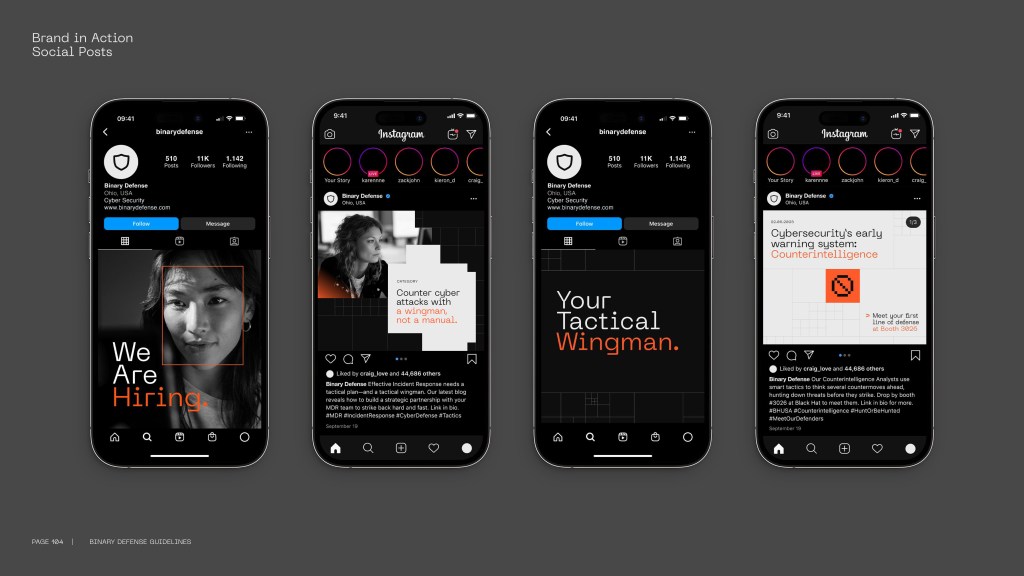
I collaborated with Superunion to help tell the complex story of its multi-award-winning BBC 2 rebrand in a clear, compelling way.

Rather than focussing on each ident individually, Superunion’s innovative new branding system curates the entire experience between programmes, effectively turning the junction into an extended ident.

Each trailer is assigned a ‘mood’ – such as ‘escapist’, ‘intense’, ‘revelatory’, ‘visceral’ or ‘anarchic’. These weave together in a seamless narrative, leading the viewer on a stimulating journey of discovery. The mood animations vary hugely in style and tone, but all feature the exact same curve motif at different points – which subtly hints at the outline of a ‘2’.

In the weeks leading up to the public launch of the new identity, I worked with executive creative director Stuart Radford and creative director Kath Tudball to craft punchy, engaging copy about the creative process to contribute towards case studies, awards entries and more.

The project won an impressive haul of awards, including Best of Show at 2019’s Brand Impact Awards, and Yellow and Wood Pencils at D&AD.

Sharing smart summer tips for lastminute.com

In 2006, I collaborated with lastminute.com to produce a 24-page booklet packed with 201 tips for smarter living – from maximising your airport time to summering like a celebrity.

Image credit: lastminute.com

3 million copies were distributed through various publications, including The Observer, The Sunday Times, GQ, Cosmopolitan and Marie Claire.

View the booklet as a PDF

Telling a passionate artist’s captivating story

Image credit: Birmingham Mail

In 2005, I collaborated with renowned graffiti artist Temper to produce a limited-edition 60-page book exploring his career so far.

Here are the 10 main chapters in full.

Part 1: Introducing…

‘He wasn’t an artist, he wasn’t an art critic, but if it didn’t look like Mussolini he’d say so. That’s the only art lesson I had’ … [more]

Part 2: The Good Die Young

Losing eight of your close family in a lifetime is devastating. Losing them in a single year is enough to tear your life apart… [more]

Part 3: Decade Collection

‘Ten years, crunched into an easily-digestible visual thing’ … [more]

Part 4: Minuteman Exhibition

‘What was the point of being the first graffiti artist in a public gallery without actually making a few statements?’ … [more]

Part 5: Popcorn Collection

For a dyslexic child struggling with words, comic books throw open a vibrant universe of storytelling… [more]

Part 6: Signature Sprite Can

‘I won everybody’s vote for eight weeks on the trot. Undisputed. It was obvious it had to be my work’ … [more]

Part 7: Saatchi & Saatchi

‘He had an office in London he wanted me to paint. He was very creative, but I didn’t know he was a Creative Director’ … [more]

Part 8: Too Good to Die Young

The next stage of the bereavement process was to splash the colour back in glorious celebration of what made them iconic… [more]

Part 9: Move Collection

‘I didn’t want to see faces; I didn’t want to see limbs. I wanted them to look awkward’ … [more]

Part 10: Outroduction

Now is the calm before the storm; the slow-motion leap before the fight begins. It’s safe to say that Temper will be around for many years to come… [more]