Creating an empathetic voice for parents in progress

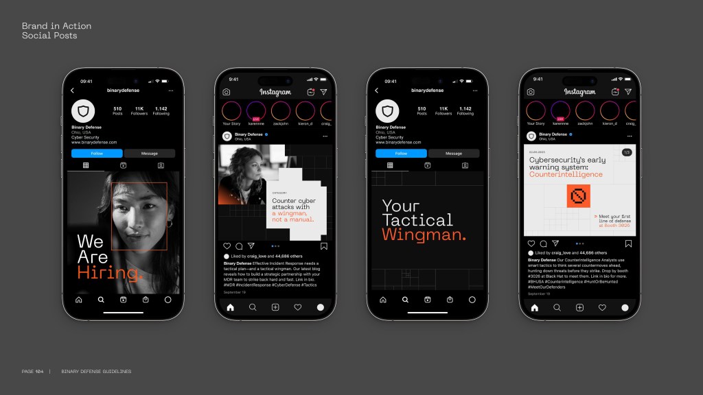
I collaborated with Manifest on a dramatic shift in brand voice for global baby products brand MAM.

MAM needed to break from category convention. Rather than placing all the focus on baby development, Manifest found strategic white space by recognising that parents are on their own developmental journey – learning, adapting, and growing alongside their child.

Image credit: Manifest

The process began with developing a new tagline that could capture the warmth and reassurance of that shared development. Several favourites emerged, including ‘Let’s grow’, ‘Together in progress’ and ‘Growth in every step’ – after extensive testing in MAM’s core territories, the version that resonated best with their market was:

Together in every step

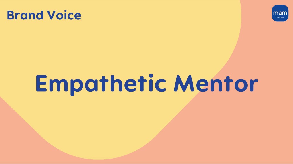
Working closely with UK strategy lead Emma Caldwell, I helped translate the strategic foundation into a distinctive brand voice – the ‘Empathetic Mentor’ – to bring this insight to life across all touchpoints.

Image credit: Manifest

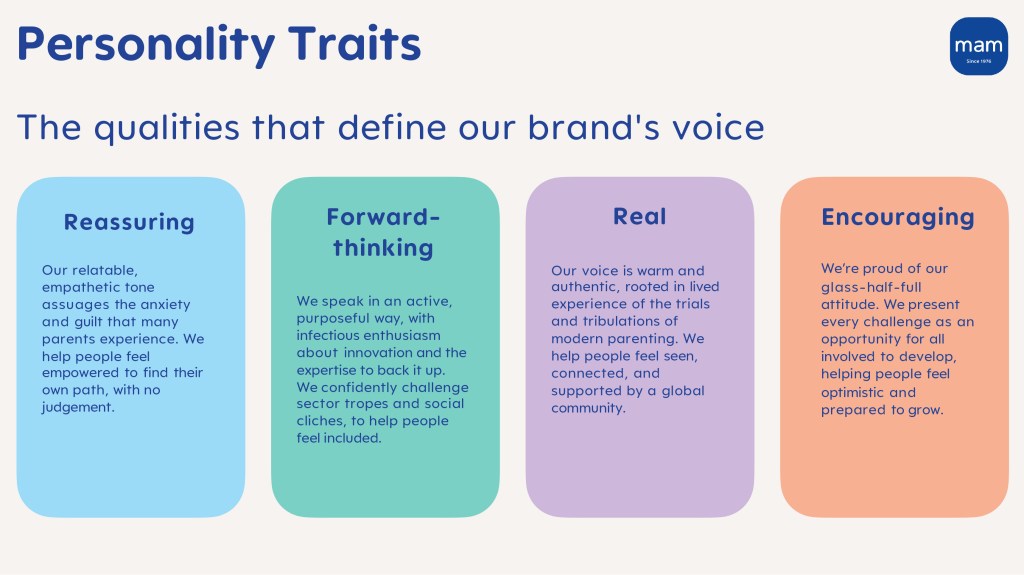
The brand voice includes four core personality traits:

Reassuring

Our relatable, empathetic tone assuages the anxiety and guilt that many parents experience. We help people feel empowered to find their own path, with no judgement.

Forward-thinking

We speak in an active, purposeful way, with infectious enthusiasm about innovation and the expertise to back it up. We confidently challenge sector tropes and social cliches, to help people feel included.
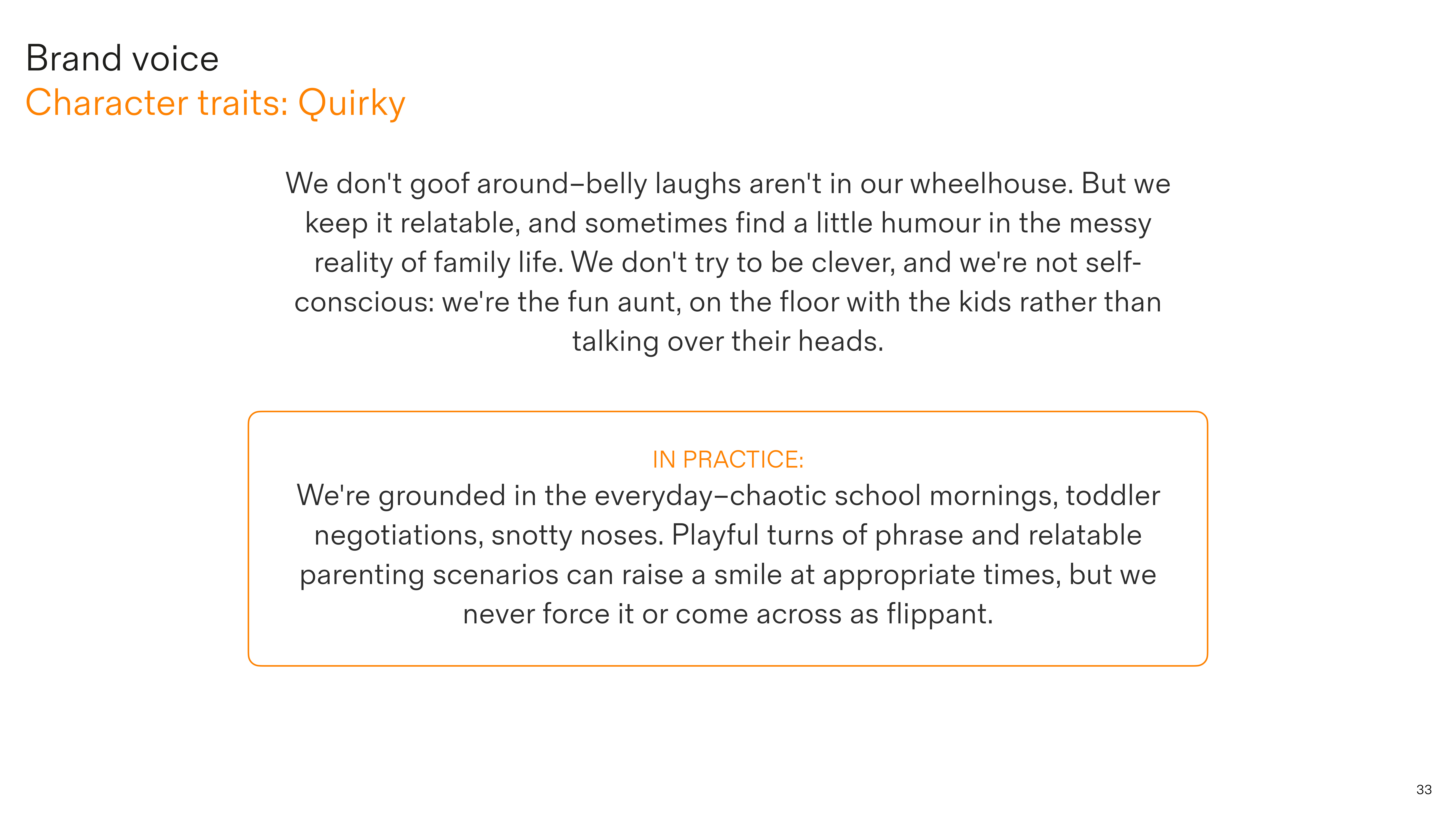
Real

Our voice is warm and authentic, rooted in lived experience of the trials and tribulations of modern parenting. We help people feel seen, connected, and supported by a global community.

Encouraging

We’re proud of our glass-half-full attitude. We present every challenge as an opportunity for all involved to develop, helping people feel optimistic and prepared to grow. 

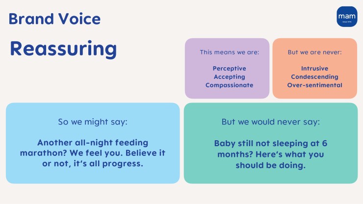
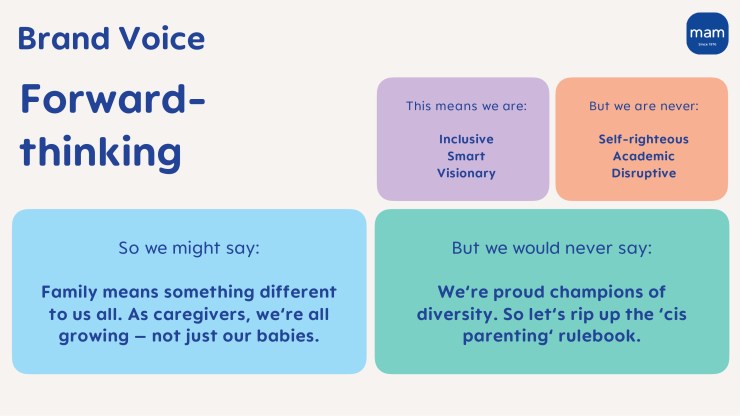
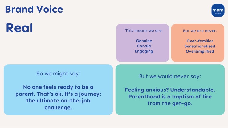
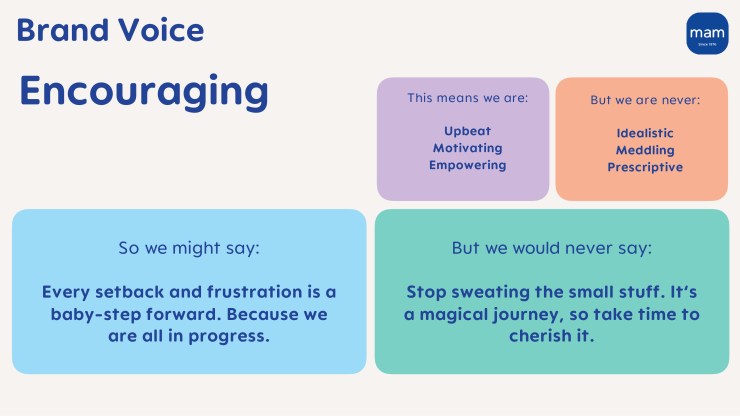
I created detailed guidance for each trait, including clear before-and-after examples to demonstrate the dramatic shift in how MAM communicates with its new ‘Empathetic Mentor’ persona.

The new voice transforms functional copy into warm, supportive conversations that help new parents feel seen, connected, and supported.

I’ve supported Manifest on a range of briefs since, including:

  • Creative campaign development for core markets in the UK and France
  • Naming architecture for MAM’s bottle portfolio in the US
  • Evolving product claims for its bottle and soother ranges to emphasise emotive and developmental benefits, in line with the new positioning

“Nick brings a wealth of expertise to every project. He tackles challenges with a deep understanding of brand strategy and creative flair. A true professional, and a creative powerhouse.”

Lauren Kennelly – director, global brand studio, Manifest

Making pediatric care feel like home

I collaborated with independent creative director Stuart Gough on brand voice and launch copy for Hometown Pediatrics — a new pediatric practice brand built to rescue families from collapsing corporate healthcare.

When Optum abruptly closed nearly 20 New Jersey pediatric practices in late 2025, around 50,000 children were left without a doctor. Hometown acquired two practices in the townships of Wall and Freehold, reopening them under a new brand within weeks.

Image credit: Hometown Pediatrics

The complication: the brand was new, but the doctors weren’t — several had been caring for the same communities for 20-30 years. Some former patients had grown up, and now bring their own kids.

The brief was clear about what Hometown shouldn’t feel like: private equity, corporate healthcare, or venture capital. One reference point was a neighbourhood coffee shop. The measure of success? At launch, the new brand should feel like it’s been there for decades.

Defining the brand voice

Stuart established the strategic positioning — ‘Part of the family’ — and three brand pillars: Medical Authority, Hyper-Local Charm, and Nostalgic Humanity.

I developed these into a brand voice framework built on five character traits:

Warm

We care about your kids (almost) as much as you do, and it shows in our writing. We’re never clinical or detached. Parenting’s tough enough, even tougher when the kids are sick. Our tone puts you at ease.

Assured

We’ve been doing this a long time, and it shows. Not because we boast or flash our credentials, but because we exude the quiet professional confidence that puts parents at ease. We’ve seen it before, and you’re in safe hands.

Sincere

We don’t oversell. Empty superlatives like “world-class care” and “exceptional service” are out. Warm words from local families speak for themselves–no buzzwords or corporate speak.

Quirky

We don’t goof around–belly laughs aren’t in our wheelhouse. But we keep it relatable, and sometimes find a little humour in the messy reality of family life. We don’t try to be clever, and we’re not self-conscious: we’re the fun aunt, on the floor with the kids rather than talking over their heads.

Imaginative

We talk to kids the way you’d talk to kids–we don’t change our personality, just change gear a little. This is where storytelling, wonder, and gentle magic come in. We create moments of delight: framing a door as a gateway to adventure; sparking curiosity in hidden details; helping the scary feel a little safer.

Image credit: Hometown Pediatrics

Bringing it to life

Craig Jackson (Combination Studio) led UX design for the launch site, with Stuart developing the visual identity. I put Hometown’s new voice into action across key touchpoints, from the homepage and service descriptions to individual provider pages built from doctor Q&As.

Browse the website at hometownkids.com.

I also developed patient communication campaigns across four audience segments, and curated provider quotes into usable soundbites while preserving each doctor’s authentic voice.

Image credit: Hometown Pediatrics

The editorial north star was ‘show don’t tell’. As a British writer crafting copy for a small-town New Jersey practice, crafting local colour based on research wouldn’t cut it — the more confident approach was knowing when to step back.

Rather than putting words in their mouths, I let the pediatricians’ voices carry the brand: capturing and curating their stories, then letting their authentic relationships with the community speak for themselves. The doctors are the brand — Hometown as a corporate entity stays nearly invisible.

Image credit: Hometown Pediatrics

The client’s instinct was not to over-craft the warmth, and this was particularly true on the homepage. Parents landing on a pediatric practice website don’t want to read through paragraphs of reassurance — they want calm, supportive, and to-the-point.

The homepage headline began as a friendly introduction: ‘Welcome to your kid’s doctor.’ Next it evolved to employ some subtle wordplay: ‘Pediatric care that’s close to home’. The final version — ‘Pediatric care for your family’ — is more descriptive, but with just enough warmth baked in.

Image credit: Hometown Pediatrics

Having tried various warm and quirky supporting lines, I concluded that less was more at this first point of contact, and more personality could come through later. ‘How can we help?’ gets straight to the point for a parent in need, with just the right balance of support, reassurance and urgency to frame the two clear CTAs underneath. Every word works hard.

“Nick was brilliant to work with. He handled the content with common sense and flexibility, while really pushing the brand narrative forward. A great person to have on your side.

Stuart Gough – independent creative director

Bringing a 200-year-old university into a new era

I collaborated with Johnson Banks to give University College London (UCL) a new brand voice, translating strategic traits into detailed, practical writing guidance.

As a Top 10 global university, UCL needed to stand out in an increasingly crowded higher education landscape. Johnson Banks had identified four core personality traits – Grounded, Optimistic, Global, and Open – that captured what makes UCL different.

Image credit: Johnson Banks

My role was to unpack each trait into actionable writing principles that demonstrate how to capture that personality across UCL’s broad range of touchpoints and audiences.

The challenge was nuanced: how do you show intelligence without alienating? How do you demonstrate optimism without sounding naive? How do you write for an international audience while keeping London’s identity?

Read more about the UCL rebrand in Johnson Banks’ case study.

Defining the brand voice

For each trait, I developed detailed guidance to address these tensions directly.

Image credit: Johnson Banks

Grounded

  1. Discuss big ideas in terms of human impact
  2. Admit when we don’t have the answer
  3. Use wit (where appropriate) to be more relatable
  4. Use clear, straightforward language

Optimistic

  1. Frame challenges as opportunities
  2. Lead with possibilities, acknowledge constraints
  3. Use forward-momentum language
  4. Show the pathway, not just the destination

Global

  1. Make rich references accessible
  2. Build context before diving in
  3. Lead with the universal, then get specific
  4. Use ‘here’ as a bridge, not a barrier

Open

  1. Provoke new ways of thinking
  2. Be approachable, not authoritative
  3. Be transparent about difficult topics

Brand voice in action

I developed comprehensive before-and-after examples across 11 different touchpoints – from UCL’s strategic plan and prospectus copy to social media posts and alumni storytelling.

Each example demonstrated how these principles work in practice, with detailed annotations showing which of the four brand personality traits were being applied, how, and why.

Before/after guidance for an all-staff newsletter. Image credit: Johnson Banks
Before/after guidance for UCL’s strategic plan. Image credit: Johnson Banks

The guidelines give writers concrete tools to apply UCL’s voice consistently across contexts, balancing credibility with accessibility, ambition with honesty, and global reach with local identity.

“I’d recommend Nick to anyone looking for a thoughtful, insightful writer who truly understands brand voice.”

Katherine Heaton – account director, Johnson Banks

Outthinking, outsmarting, and outlasting rivals

I collaborated with Territory Studio to give cutting-edge cybersecurity firm Binary Defense a brand voice packed with both attitude and warmth.

Most cybersecurity brands trade on fear and impenetrable technical jargon. Binary Defense needed to stand out by balancing expertise with genuine human connection.

OOH concept. Image credit: Territory Studio

Territory developed a clear brand positioning – ‘Agile, human-first cyber security’ – that informed four new brand values:

• Expert
• Maverick
• Adaptable
• Human

My role was to translate this foundational thinking into a verbal identity that the client could run with.

Read more about the rebrand in Territory’s case study.

Brand personality

The breakthrough was defining Binary Defense as the ‘Tactical Wingman’ – a brand personality that bridged military precision with social camaraderie. Together, these two words strike the balance between the tactical expertise needed to outsmart cyber threats, and a trusted wingman who’s got your back and helps you sleep at night.

Image credit: Territory Studio

I translated each brand value into an actionable personality trait:

Expert > Insightful

We show our expertise through smart tactical thinking, and don’t just tell people about our technical prowess. We bring people along on the journey, sharing practical, actionable insights as we go.

Maverick > Unconventional

We rebel against the status quo, and fly in the face of mediocrity. Our voice feels fresh in the sector, flipping the script with unexpected turns of phrase that emphasize the people involved, as well as our outside-the-box tactics.

Adaptable > Dynamic

We speak with drive and energy, flexing our tone to capture the audience’s attention (and keep it). We constantly adapt to the latest threats, and think on our feet with language too – discussing tactics with precision, while using analogies to make complex scenarios instantly.

Human > Straight-talking

You need a trusted ally in your corner who has your back. Our tone cuts through without the jargon: We’re the good guys, here to take down the bad guys. We tell it like it is – our language is carefully crafted. Every word counts.

Website homepage copy. Image credit: Territory Studio

Campaign tagline

I also developed an attitude-packed tagline that could capture the essence of the new brand personality:

Outthink. Outsmart. Outlast.

This became Binary Defense’s battle cry – a rhythmic, memorable encapsulation of their competitive edge. Confident and dynamic without being overly aggressive or threatening, it positions Binary Defense as playing a smarter, longer game than its rivals.

Social post examples. Image credit: Territory Studio
LinkedIn origin story. Image credit: Territory Studio

The brand guidelines include carefully chosen before/after examples – from website homepage copy to Insta posts, digital banner ads to a LinkedIn origin story – demonstrate how to maintain the ‘Tactical Wingman’ voice in a way that balances professional credibility with human authenticity.

Crafting branded content with editorial integrity

As a contributing editor for Creative Review, I’ve created content strategies for global brands including Frontify, Figma, Meta and TikTok.

Together, we transformed CR’s approach to branded editorial, developing multi-part series that engage an audience of senior design professionals while achieving each partner brand’s strategic objectives.

Image credit: Creative Review / Shutterstock

The work balances three objectives: maintaining CR’s high editorial standards, engaging the design community with compelling and relevant insights, and achieving measurable results for brand partners.

By treating sponsored content as seriously as editorial features – with rigorous research, compelling angles, and authentic perspectives – the content earns reader attention rather than interrupting it.

Figma

Why businesses should be led by designers
At an executive level, design thinking can transform an organisation from the inside – and this kind of cultural shift may prove vital for many brands’ survival

Why non-designers must understand design better
Appreciation of the design process should permeate an entire organisation, not just its in-house creative team

Frontify

The trick to pushing creative limits without losing control
How to balance rule-breaking creativity with the need for measurable performance and brand governance

Why a brand-building platform helps creativity thrive
Some extra groundwork to create a ‘single source of truth’ when building a brand empowers everyone down the line

Team ITG

How virtual production is changing the way ads are made
Virtual production unlocks limitless creative possibilities, while making the process more efficient and sustainable

Pushing the limits of creativity with virtual production
VP’s rapid evolution helps brands break new ground without breaking the budget

Video credit: Creative Review / Team ITG

TikTok

How brands can be authentic on TikTok
Insider advice from Burberry, Rimmel and Duolingo to thrive in TikTok’s world of democratised creativity

Why brands should be part of the community on TikTok
Move aside, always-on marketing: brands need to be ‘always in’ to win the trust and attention of TikTok’s diverse communities

Meta

How the metaverse could transform brand engagement
Early adopters in fashion and entertainment are blazing a trail, but how could brands in other sectors embrace the potential of the metaverse?

Unlock more immersive brand experiences in the metaverse
Brands must dream big to push experience design limits in the metaverse

“Nick has all the attributes of a great content strategist – a strong sense of editorial values, audience interests and commercial awareness. He has become integral to our team.”

Michael Barnett – Commercial content editor, Creative Review and Marketing Week

Shifting perspective with a poetic wobbly mirror

I collaborated with NB Studio and SEA to create ‘Conversion’, a two-metre-high fairground-style distorting mirror.

Part of the 26 Bridges initiative for Bloomsbury Festival 2025, the piece presents Millennium Bridge as a symbolic connection between two London icons: St Paul’s Cathedral and Tate Modern.

Photo credit: NB Studio

The title ‘Conversion’ operates on multiple levels: religious conversion (Catholicism to Protestantism); architectural conversion (Bankside Power Station becoming Tate Modern); and the broader transformation of the Bankside area from historic den of iniquity to cultural hub.

At the heart of the project is a palindromic poem that shifts perspective when flipped. Depending on which direction it’s read, dual-meaning terms – ‘vice’, ‘vision’, ‘muse’, and ‘divine’ – switch between sacred and secular significance.

Photo credit: NB Studio

The distorting mirror concept playfully references Millennium Bridge’s notorious nickname – ‘the wobbly bridge’ – as well as the blurred lines between the language used for both readings of the mirror poem.

The poem is typeset using striking matt-silver vinyl lettering, featuring a winding, river-like gutter down the centre to mimic the flow of the Thames.

The 26 Bridges artworks were auctioned in October 2025 to raise funds for University College London Hospitals (UCLH), specifically supporting a specialist clinical nurse for skin cancer patients.

Press coverage

Distorting mirror bridges poetry, design and perspective for NHS cancer care auction
Creative Boom

This shifting mirror artwork is a love letter to London landmarks (and it could be yours)
Creative Bloq

Featured in Design Week’s The Outline on 24 September 2025

Other 26 projects

Besides 26 Bridges, as an active member of the 26 writers collective I have contributed to many projects since 2020.

Click each project title to reveal more details:

26 Memento Mori

I created a short fiction series called Seasonal Transitions, depicting a dystopian future where experiences of death are controlled – but human emotion can’t be contained.
• Spring: The Memory Gardener
• Summer: The Fever Collector
• Autumn: The Change Artist
• Winter: The Silence Keeper

26 Places in Cornwall

My poem captures the rich history of the smuggling cove at Lansallos, exhibited with accompanying photography at the Poly Gallery, Falmouth.

26 Inspirations

I teamed up with my three-year-old son for an exhibition at Bloomsbury Festival on the theme of inspiration. This included a stream-of-consciousness poem giving a snapshot of the world through his eyes.

26 Orphans (with The Foundling Museum)

I chose cult-favourite bounty hunter Boba Fett for this project about fictional orphans and foundlings. Set inside the Sarlacc’s stomach, my sestude explores Fett’s identity as an orphaned clone as he recalls witnessing his father’s death.

Threads of Time (with Fine Cell Work)

I was a senior editor for this coffee-table book telling the stories of the prisoners who lent their newfound needlework skills to a rich array of artefacts.

26 Wild (with The Wildlife Trusts)

I championed the endangered narrow-headed ant through a short poem. I also contributed a haiku lamenting damage to seagrass meadows for 26 Pledges, another Wildlife Trusts collaboration highlighting at-risk habitats and biomes.

26 Weeks

For this project capturing the trauma of Covid-19 from 34 different perspectives, my conversation partner was Jaipur-based cultural guide Raj – who, over the course of the pandemic, lost both his livelihood and his father, and rediscovered the importance of the simple things.

Dejumbling insurance with mischievous wordplay

I collaborated with Taxi Studio to develop the brand voice for fintech challenger Yoloh.

Most insurance brands trade on fear and confusion. Yoloh set out to flip that script – helping people spend more time living, not form-filling.

Working closely with Taxi’s brand and strategy teams, I helped develop ‘Insurance dejumbled’ – a powerful brand platform that untangles complexity at every touchpoint.

Video credit: Taxi Studio

At the heart of the brand expression is four-fingered digital assistant ‘Andi’. When you first fire up the app, the phrase ‘Andi censured jumble’ is nimbly rearranged into the tagline ‘Insurance dejumbled’ – demonstrating the brand’s unique offer in a playful, memorable way.

Read more about the Yoloh strategy in Taxi’s case study.

Yoloh’s ambigram brand mark is identical when flipped upside down, inspiring the supporting line: “Making life easier, whichever way you look at it.”

Video credit: Taxi Studio

We then took the creative concept of ‘dejumbling’ to the next level, transforming the many different varieties of insurance into memorable, contextually relevant anagrams.

  • “Any incidents ruin me” became “indemnity insurance”
  • “Canal in dentures” became “dental insurance”
  • “Mourns a Citroën” became “motor insurance”

These weren’t just wordplay – they symbolised how even the most tangled concepts could be unscrambled into something human and approachable.

I developed Yoloh’s brand voice, starting with a top-level brand personality: ‘Attentive Guide’. Built around three core principles – Accessible, Attentive and Proactive – the voice turns tedious policy wording into friendly, human conversations, with a touch of warmth and wit.

“The breadth and depth of Nick’s knowledge is such a rich foundation for his copywriting. He gets under a new brand’s skin quickly and with all the smarts in all the right places. He provides so much more to creative outcomes than words.”

Emma Hopton – creative strategist, Taxi Studio

Press coverage

Taxi Studio balances trust and play in Yoloh rebrand
Design Week

Taxi reveals new brand for insurtech platform Yoloh
Creative Boom

How a fun rebrand and a new mascot boosted this brand’s reputation tenfold
Creative Bloq

Overplaying their hand
Brand New (subscription needed)

Awards for Yoloh
Bronze Award – Brand Impact Awards 2025

Championing a cleaning brand’s sustainable vision

I helped Superunion tell the brand story of eco-friendly cleaning company Delphis Eco.

Following a joint briefing with the creative team and the client, I conducted an in-depth interview with Delphis Eco’s passionate, self-confessedly belligerent founder Mark Jankovich.

The first section, below, captures the story’s unlikely origins in the world of cut-throat finance – where Jankovich had the epiphany that drove him to drop everything and radically change his career direction.

“I woke up one day and thought, ‘Enough’s enough.'” – Mark Jankovich

Mark’s story

It was 2007, the year before the finance sector went into meltdown.

Mark had been working on a more joined-up approach to RBS Group’s corporate social responsibility. He argued that the banking giant needed to consider its impact on the world.

But profit was king, and Mark’s holistic plan was laughed out of the room. He quit the next day, with a burning desire to make a meaningful difference in whatever way he could. His goal was simple: build a business, any business, that could have a net-positive impact. After scouring the globe for candidates, he discovered a Liverpool-based chemist making professional-standard cleaning products from eco-friendly natural ingredients.

Delphis Eco leads by example when it comes to sustainability

The business had been struggling, and had racked up significant debts. But despite having no experience in the sector, Mark saw huge potential for social and environmental impact.

Shortly after the birth of his second child, and with no salary as a safety net, he threw everything he had into the venture, adopting a one-star roadside hotel as a rudimentary base near the warehouse in Bootle while he worked to turn the business around.

The brand story is set firmly in the context of the global climate emergency

Mark was prepared to roll up his sleeves and get his hands dirty. To win one of Delphis Eco’s first major contracts, he spent seven months getting up at 4am to scrub Iceland stores, demonstrating to the supermarket why it should switch.

He also knew he had to get the products into the right hands, so cut out the middleman. Knowing the Prince of Wales to be an ardent eco-campaigner, he cold-called Clarence House and challenged the Prince’s staff to test the products. The risk paid off, ultimately leading to Delphis Eco receiving two Royal Warrants.

At the heart of Delphis Eco’s success story is Mark’s refusal to accept something is impossible, and the passion, belligerence and drive to prove it can be done.

Mark has lobbied the UK government to promote sector-wide change

The story goes on to explore how Delphis Eco has responded to the bigger-picture context of the climate emergency, and reveals the brand’s many sector-leading green innovations and related campaigns – including lobbying for meaningful change at the highest level.

Celebrating 50 years of the Virgin brand

I am the author of Virgin By Design, a premium ‘coffee-table’ book celebrating 50 years of the Virgin brand.

Collaborating closely with the Virgin Group brand team and the book’s publisher Thames & Hudson, I helped develop a content strategy to appeal to brand designers, creative marketeers and ambitious entrepreneurs.

Rather than a chronological retrospective, we agreed it would be more compelling to tell the story thematically, exploring the unique characteristics that make the Virgin brand special.

Buy a copy of Virgin By Design on Amazon

The process involved over 120 interviews with CEOs, CMOs and other influential individuals responsible for shaping the past, present and future of the Virgin brand – from the early days of Virgin Records and Virgin Atlantic in the ’70s and ’80s, through to present-day innovations from the likes of Virgin Galactic and Virgin Voyages.

Drawing on hundreds of thousands of words of transcript, I crafted the many diverse stories into 10 distinct chapters. These explored areas such as Virgin’s ‘cheeky start-up’ mentality, the importance of taking risks and innovating, the ‘feel-good experiences’ and ‘magic moments’ at the heart of the brand, and how Virgin can stay relevant for the next 50 years.

With multiple senior stakeholders involved – including Virgin Group’s chief brand officer and global CEO, as well as Richard Branson himself – my copywriting brief was to capture Virgin’s brand values, while remaining engaging and entertaining for an external audience.

Nick helped us shape a cohesive narrative from multiple voices. He was quick to understand Virgin’s brand principles and history, and convey it seamlessly throughout the book. Nick’s skill in finding compelling stories translates to a joyful yet comprehensive read. He was a joy to work with.

Charlotte Bufton – brand manager and project lead, Virgin
Virgin By Design’s 10 thematic chapters. Image credit: Virgin

Fascinating archive photography, striking campaign visuals and playful commissioned illustration bring the featured stories to life.

The design, by Pete Rossi at RM&CO, encourages different levels of engagement. Readers can flick through for visual inspiration, or deep-dive into each chapter’s theme.

Content formats vary from bite-size captions to long thematic reads, bound-in as inserts amongst full-bleed images to maximise visual impact. Gatefolds expand the canvas at key points to do milestone campaigns justice.

“Nick’s deep understanding of how branding and design work within a business, and his industry knowledge and contacts, make him an invaluable member of a creative team.”

Andrew Sanigar – commissioning editor, Thames & Hudson

Virgin By Design was published by Thames & Hudson in March 2020.

Awards for Virgin By Design
Silver Award – Graphis Design Annual 2021
Highly Commended – Drum Design Awards 2020
People’s Choice – Creativepool Annual 2020

Asking provocative questions of top brands

Cover of Wild Thinking. Image credit: The Clearing

I helped The Clearing produce a series of videos to promote the studio’s new book, Wild Thinking.

Wild Thinking features 25 unconventional solutions to business challenges, from pioneering thinkers at global brands. I developed a content strategy to draw out particularly engaging themes from the book, and conducted piece-to-camera interviews with key contributors.

Read more about Wild Thinking on Kogan Page’s website…

Working closely with publisher Kogan Page, I then scripted a series of short-form videos. This included exclusive cuts for LinkedIn and Twitter, posing bonus questions from The Clearing’s ‘Wild Cards’ – the pack of 100 provocative questions that inspired the book.

Selection of cards from the Wild Cards pack. Image credit: The Clearing

Read more about Wild Cards on The Clearing’s website…

Here are three of the videos:

How mediocrity can be a great motivator

CMO John Allert discusses McLaren’s unapologetically uncompromising culture, and why a fear of mediocrity keeps the team sharp.

Why leading from the top is outdated

Former Dropbox PR chief Nick Morris shares his tried-and-trusted collaborative approach for engaging and inspiring a team.

What ‘brand purpose’ looks like in practice

CCO Juliet Slot explains how Ascot Race Course translates abstract brand values into meaningful everyday actions for its employees.

Nick has a unique offer – he’s a writer, a thinker, an interviewer and a burst of energy. He immediately became part of our team when we launched our Wild Thinking book, driving content and building relationships for our short films. It was fun, and it delivered great results.

Jules Griffith, marketing director, The Clearing