I collaborated with independent creative director Stuart Gough on brand voice and launch copy for Hometown Pediatrics — a new pediatric practice brand built to rescue families from collapsing corporate healthcare.
When Optum abruptly closed nearly 20 New Jersey pediatric practices in late 2025, around 50,000 children were left without a doctor. Hometown acquired two practices in the townships of Wall and Freehold, reopening them under a new brand within weeks.
The complication: the brand was new, but the doctors weren’t — several had been caring for the same communities for 20-30 years. Some former patients had grown up, and now bring their own kids.
The brief was clear about what Hometown shouldn’t feel like: private equity, corporate healthcare, or venture capital. One reference point was a neighbourhood coffee shop. The measure of success? At launch, the new brand should feel like it’s been there for decades.
Defining the brand voice
Stuart established the strategic positioning — ‘Part of the family’ — and three brand pillars: Medical Authority, Hyper-Local Charm, and Nostalgic Humanity.
I developed these into a brand voice framework built on five character traits:
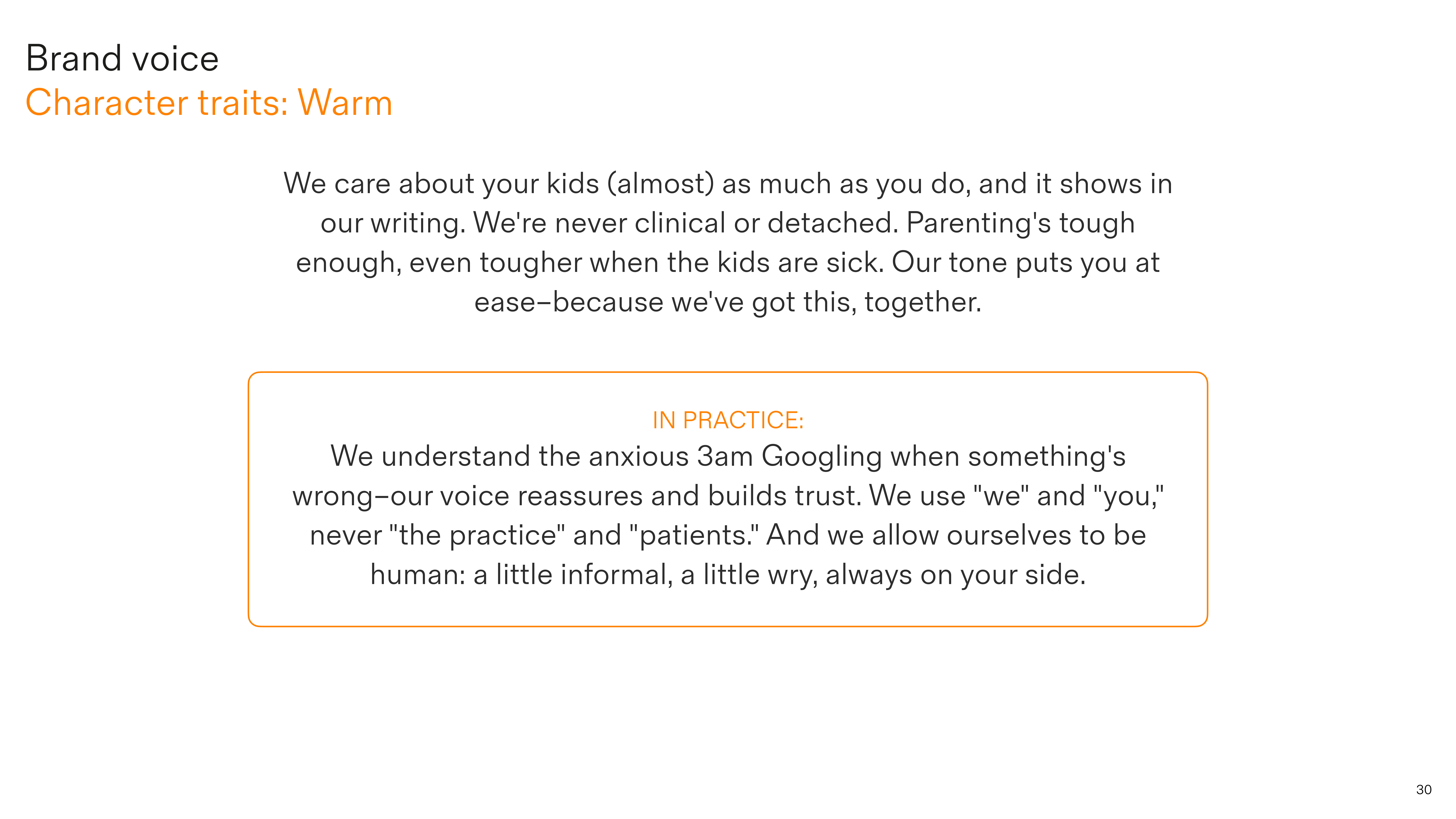
Warm
We care about your kids (almost) as much as you do, and it shows in our writing. We’re never clinical or detached. Parenting’s tough enough, even tougher when the kids are sick. Our tone puts you at ease.
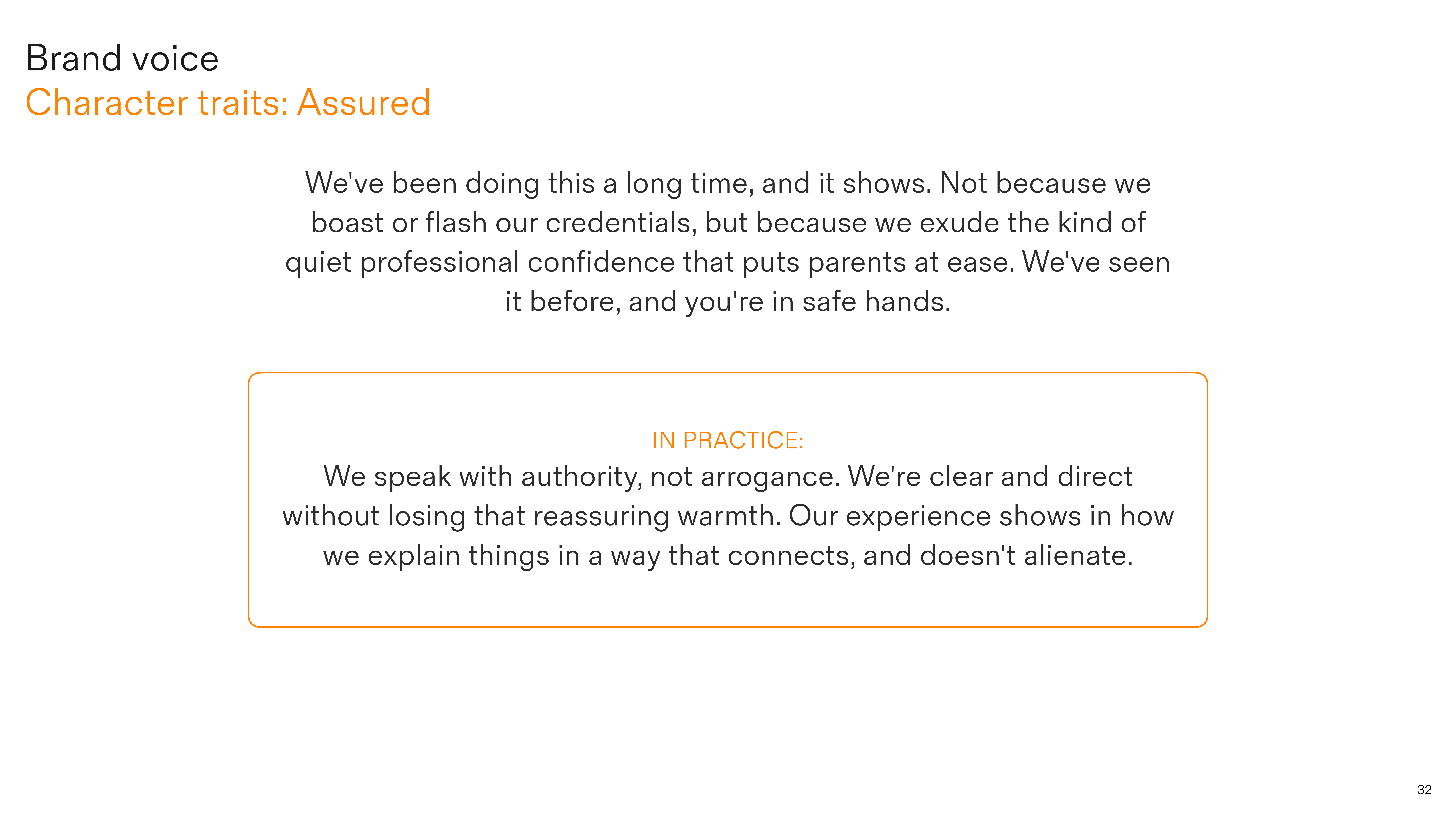
Assured
We’ve been doing this a long time, and it shows. Not because we boast or flash our credentials, but because we exude the quiet professional confidence that puts parents at ease. We’ve seen it before, and you’re in safe hands.
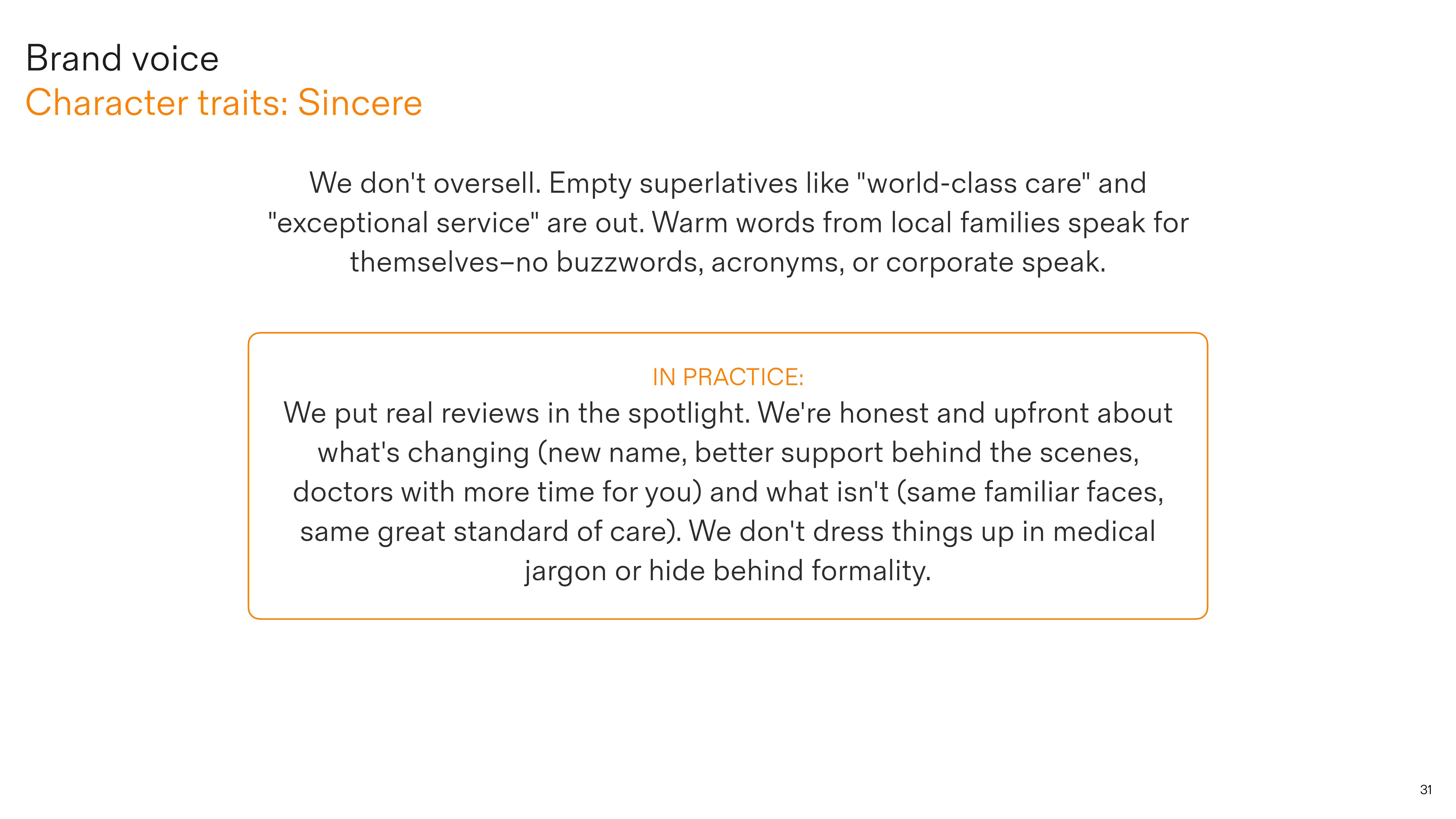
Sincere
We don’t oversell. Empty superlatives like “world-class care” and “exceptional service” are out. Warm words from local families speak for themselves–no buzzwords or corporate speak.
Quirky
We don’t goof around–belly laughs aren’t in our wheelhouse. But we keep it relatable, and sometimes find a little humour in the messy reality of family life. We don’t try to be clever, and we’re not self-conscious: we’re the fun aunt, on the floor with the kids rather than talking over their heads.
Imaginative
We talk to kids the way you’d talk to kids–we don’t change our personality, just change gear a little. This is where storytelling, wonder, and gentle magic come in. We create moments of delight: framing a door as a gateway to adventure; sparking curiosity in hidden details; helping the scary feel a little safer.
Bringing it to life
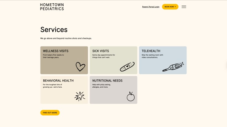
Craig Jackson (Combination Studio) led UX design for the launch site, with Stuart developing the visual identity. I put Hometown’s new voice into action across key touchpoints, from the homepage and service descriptions to individual provider pages built from doctor Q&As.
Browse the website at hometownkids.com.
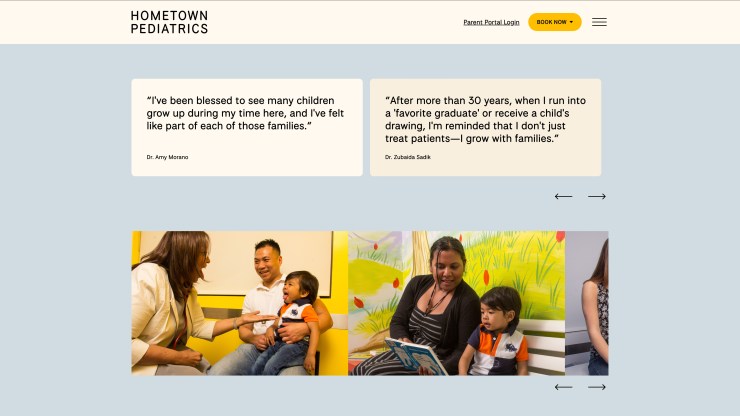
I also developed patient communication campaigns across four audience segments, and curated provider quotes into usable soundbites while preserving each doctor’s authentic voice.
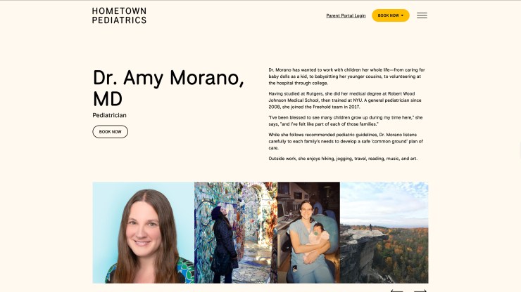
The editorial north star was ‘show don’t tell’. As a British writer crafting copy for a small-town New Jersey practice, crafting local colour based on research wouldn’t cut it — the more confident approach was knowing when to step back.
Rather than putting words in their mouths, I let the pediatricians’ voices carry the brand: capturing and curating their stories, then letting their authentic relationships with the community speak for themselves. The doctors are the brand — Hometown as a corporate entity stays nearly invisible.
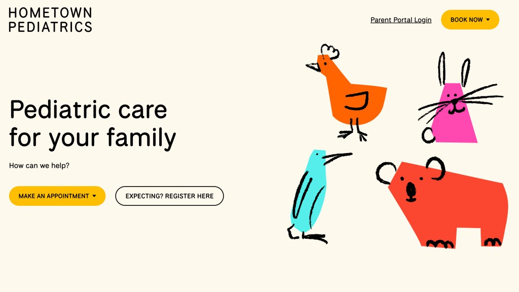
The client’s instinct was not to over-craft the warmth, and this was particularly true on the homepage. Parents landing on a pediatric practice website don’t want to read through paragraphs of reassurance — they want calm, supportive, and to-the-point.
The homepage headline began as a friendly introduction: ‘Welcome to your kid’s doctor.’ Next it evolved to employ some subtle wordplay: ‘Pediatric care that’s close to home’. The final version — ‘Pediatric care for your family’ — is more descriptive, but with just enough warmth baked in.
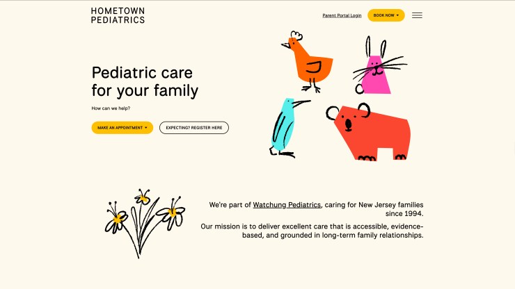
Having tried various warm and quirky supporting lines, I concluded that less was more at this first point of contact, and more personality could come through later. ‘How can we help?’ gets straight to the point for a parent in need, with just the right balance of support, reassurance and urgency to frame the two clear CTAs underneath. Every word works hard.
“Nick was brilliant to work with. He handled the content with common sense and flexibility, while really pushing the brand narrative forward. A great person to have on your side.”
Stuart Gough – independent creative director